


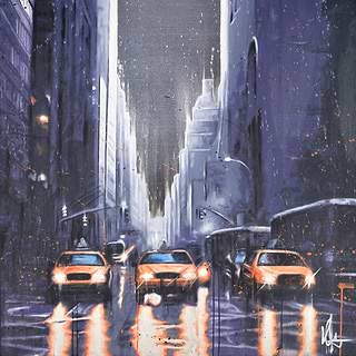
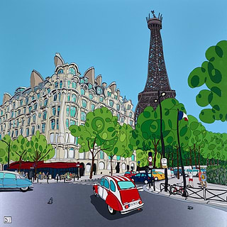
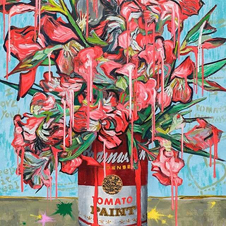
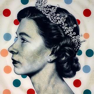


21st November, 2025, I 3-5 Minute read
Curate Your 2026 Palette with Clarendon Fine Art
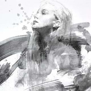
Clarendon’s colors of the year for 2026 embrace lived-in elegance - earthy, understated and muted jewel tones that let personality take centre stage. These refined neutrals are brilliant news for art lovers, acting as a quiet canvas that allows artwork to shine. And it’s not just about wall colours: the same natural, grounded hues are also appearing within the artwork itself, introducing subtle warmth or rich accents to your home. Reflecting a wider move toward self-expression, these tones - whether on the walls or in a painting - help create spaces where art can complement, contrast or gently enhance, always supporting the room’s character without overwhelming it.
Mocha, Espresso
& Brown Shades


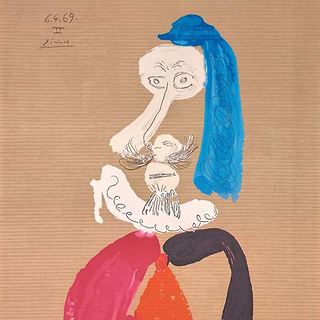
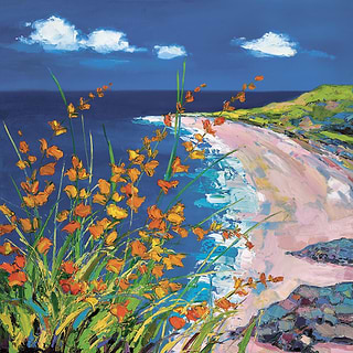
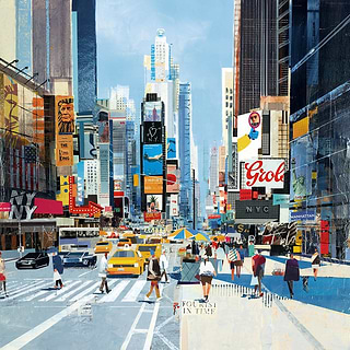
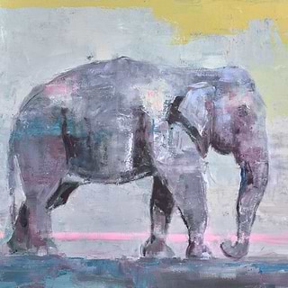
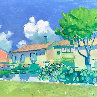
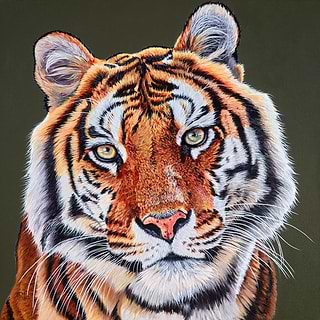
Mocha is great news for art lovers. Sophisticated, earthy and beautifully neutral, it provides the perfect setting for artwork, allowing color and texture to shine. Its warmth and depth give collectors the confidence to display more expressive or vibrant pieces, while its versatility means it harmonises effortlessly with muted tonal work, flatters metallics in both sculpture and wall art, and lets bold abstracts take centre stage. At Clarendon, we’re seeing collectors embrace these palettes to complement their art choices: the vibrant colours of a Simon Kenny abstract radiate beautifully against mocha or taupe walls.


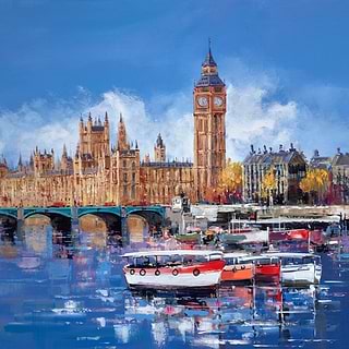
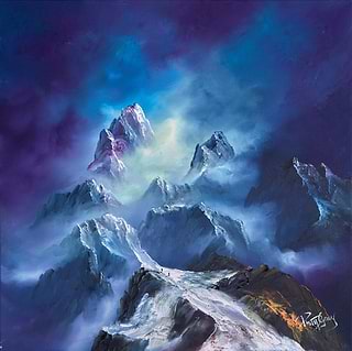
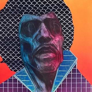
Sapphire


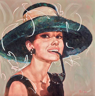
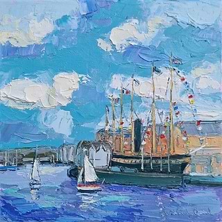
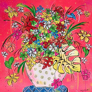
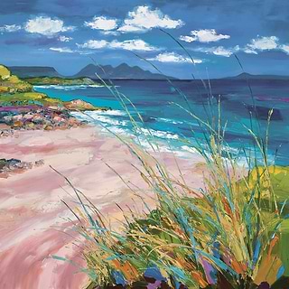
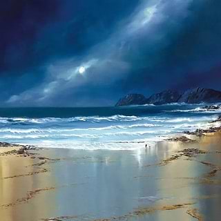
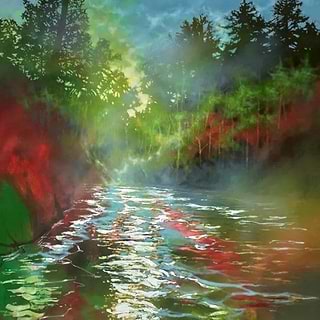
Sapphire is set to be one of 2026’s most sophisticated color trends - a jewel-toned blue that embodies creativity, calm and quiet confidence. In interiors, it adds depth and effortless luxury, adding drama that doesn’t overwhelm. As a backdrop, its richness enhances color and texture, allowing artwork to resonate with greater intensity. And for collectors who prefer to add colour through artwork rather than paint, a piece infused with sapphire tones can transform a room: anchoring the space, introducing vibrancy, and offering a refined touch of boldness. It’s a timeless shade that enriches both the art and the environment around it, setting the tone for expressive, art-led living in 2026.


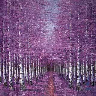
Plum


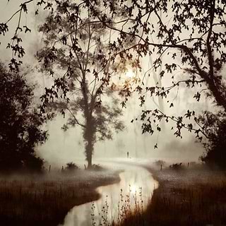
Plum is one of the most atmospheric colours in the 2026 palette - a deep, velvety hue that adds instant nuance to a room. With its blend of richness and restraint, it creates interiors that feel intimate yet sophisticated. On the walls, plum brings a luxurious sense of depth that beautifully elevates lighter artworks, metallic highlights and sculptural forms. When introduced through the artwork itself, plum tones bring emotional resonance, adding a subtle intensity that draws the eye and enriches the space. It’s a shade that rewards lingering - perfect for collectors who love interiors with mood, texture and individuality.
Teal


Teal looks set to be one of the year’s most adaptable colors - lively but composed, modern yet timeless. It brings a fresh clarity to interiors, offering a calm undercurrent that allows art to speak with confidence. Used as a backdrop, teal adds quiet vibrancy, enhancing color detail and brushwork without overpowering the room. When featured within an artwork, it becomes an expressive accent, injecting a sense of energy and sophistication. Its versatility is what sets it apart: teal works effortlessly across minimalist schemes, layered textures and statement art collections.
Moss Green


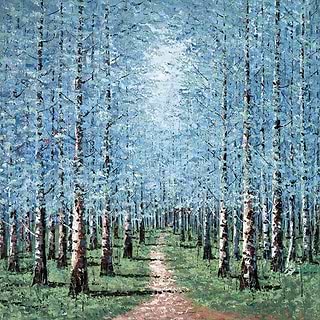
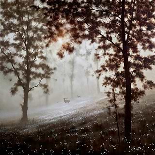
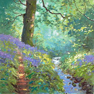
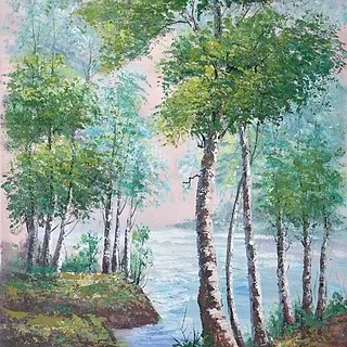
Moss green has a restorative quality that makes it a standout for 2026 - soft, grounded and effortlessly harmonious. It introduces a sense of stillness to interiors, echoing natural landscapes in a way that feels modern rather than rustic. As a wall color, moss green creates a gentle, enveloping atmosphere that allows artworks to reveal new subtleties in tone and texture. When it appears within the art itself, it brings a calming, organic presence that settles a room and enhances its sense of flow. It’s a quietly powerful hue — one that connects art, space and emotion with understated elegance.


Terracotta
& Deep Reds


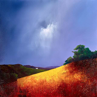
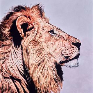
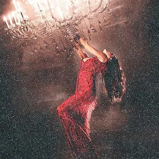
Terracotta and deep red hues are central to the 2026 earthy palette, bringing warmth, richness and a sense of authenticity into contemporary interiors. Evoking sun-baked clay and hand-crafted materials, they create spaces that feel tactile, expressive and rooted in nature. As a backdrop, they enrich artwork with natural warmth, creating a soft frame that intensifies shadows, highlights and colour across a wide range of artworks. And when echoed within the art itself, these hues bring a gentle sense of warmth and grounding, deepening the room’s connection to the natural world.

